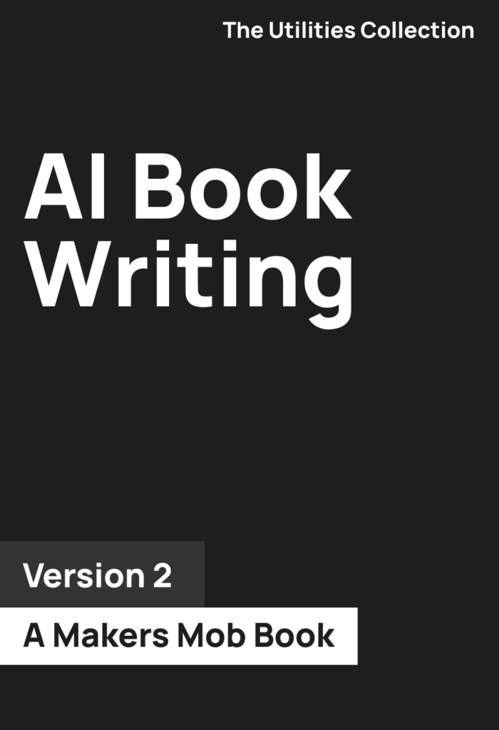
It can be easy to sit down with your ebook and slap on any ol’ picture and call it a day when it comes to the cover. Or you could create a unique cover that stands out from the crowd and pulls people in.
But is the cover of your ebook really that important? If the book is selling just fine then no it’s not important.
If you feel you need to stand out in a field of sameness then yes, it’s very important.
So let’s go over our most important ebook cover design tips.

Our Favorite eBook Cover Design Tips Every Author Should Follow
As you might’ve guessed here at Odd Noodle we make sure to take a different look at things even when the general advice is the best and this first tip is a great example.
1. Check Covers In Your Genre
We love being different, but there is a catch to being different when creating an ebook cover.
If your genre is known for a specific style of cover then that might be what your audience is looking for. To go against that could mean you’re overlooked.
On the other side of the coin being different than others in your genre could make you standout and draw more interest to your book.
2. Choose an Image That Tells a Story
This is more so for fiction books. The cover should give a glimpse into what people should expect from your book.
It’s why most fantasy books have the protagonist taking some type of action.
3. Easy on the Words
Your goal isn’t to write a book on the book cover. Use a few words as possible that help your audience gain an understanding of what the book is about.
This is easier said than done but it’s very important.
This also allows you to make the text easier to read. The more words you have on your cover, the small the font has to be. The easier things are to read the more people will read them.
Here some other typography tips for your cover:
- Reserve one half of the cover for the title. Let it stand on its own.
- The title should have the largest font. It’s not a byline to your book.
- Let the words breathe. Give everything space. It will have a bigger impact.
4. Use Complementary Colors
Now’s not the time to create some weird color combo that looks cool to you but atrocious to the rest of the world.
Use complementary colors that go well together and feel as though the book was designed with intention.
5. Let Things Breathe
Space is good.
Not every element on your cover wants to be trapped on the same elevator.
6. Dimensions Exist
Stick to the standard dimensions of the platforms that you’re going to publish on.
7. Stick to Themes for Series
If your book is part of or going to be a part of a series then stick to a single them so people feel as though each book is tied together.
8. Keep It Simple
Fancy doesn’t always mean better.
9. Break These Rules
These are merely guidelines. If you feel that you can break these rules and create a design that is unique and stands above the rest then by all means go for it.
10. Love It
If you don’t love your book cover then don’t pretend that you do. It’s your book and it means something to you.
That includes the cover.
The book cover is meant to be enjoyed not only by your audience, but by you as well. If you don’t love it then it’s back to the drawing board.
Looking for Ideas?
Then be sure to check out our ebook cover design ideas to pull inspiration from.
And don’t forget to check out our favorite tools to create an ebook!

